There's a high-res version available at Habs Eyes on the Prize.
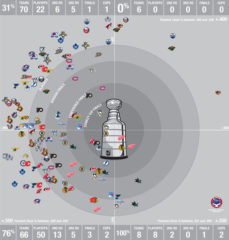
Advanced hockey stats can be intimidating, I know. But this one's super-simple. "Fenwick" is the differential between the shots a team takes, and the shots taken by its opponent. Think of it as +/-, but for shots instead of points. A .500 percentage is average. "Fenwick close," which this graphic shows, is the same thing, but only in one-goal situations in the first and second periods, and in tied games after that. It's a more effective baseline that discards situations where one team is trying to run out the clock, or desperately catch up.
The graphic charts every team's Fenwick close since the 2007-2008 season. It's broken up into 50-percentage-point quadrants, from .400 to .600. Read it counterclockwise from the top right. Zero teams with the lowest Fenwick close have made the playoffs in the last five years. Every team with the highest Fenwick close has played into May, with three of the eight reaching the Cup finals. Even discarding those outliers, there's an enormous correlation with being on the plus side of .500.